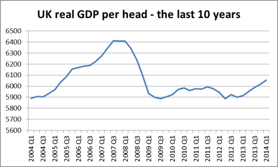
You will see that over the last year, it is moving back upwards, having fallen for some time below the level the government inherited in 2010 – the product of austerity. We calculate that GDP per head is now about 1.4% higher than in Q2 2010 when the Coalition government took office. That is an average of just 0.35% per year so far. Which is, to be frank, almost invisible. And we still remain far below peak GDP per head in 2007, as the chart shows.
In fact, we’ve just clawed our way back to 2005!


One Response
Jeremy, a telling chart indeed. A suggestion. Over at FlipChart there is a graph of GDP against time with a long term trend line and OBR forecast in it. http://flipchartfairytales.files.wordpress.com/2014/04/screen-shot-2014-04-07-at-10-32-57.png .
Mainly Macro has a similar with a log y axis scale at http://mainlymacro.blogspot.co.uk/search?updated-max=2014-04-19T16:36:00-07:00&max-results=7 .
The area between actual and the trend line is “lost output”. You can see the results of Thatcher and Major assaults on fiscal spending, Mr Osborne is in a class of his own, even when you balance out the great recession affects before the Q2 2010 election. (Whence the country went from the frying pan into the fire.)
Keep it simple for Joe Public (no x^n scales). We should not loose sight of what the 99% have lost in the name of an out of date neo-liberal economic ideology.