By Jeremy Smith
We were struck this week by the news from Forbes magazine that there are now some 1,426 billionaires in this world of ours (or do we mean theirs?). We tweeted
“So USD 1,426,000,000,000 minimum. 1bn on 1USD a day = quarter of this”
Fair enough, we felt, to make the point that 1 person in 7 on planet earth lives off almost nothing whilst a tiny number of hyper-rich have “enclosed” the wealth created by the rest of us for their own benefit and delight. But we were conscious that in comparing wealth (of the billionaires) with income (of the poorest) we weren’t comparing like with like. So let’s now look at both wealth and income, making a few reasonable estimates.
In short, we calculate that each billionaire has assets that are 38 million times greater than their ultra-poor human counterparts; that the total annual income of the billionaires on the one hand, and the billion poor on the other, is almost exactly equal; and that each billionaire has an income potential around 694,000 times higher than the ultra-poor counterpart. We confess we’ve had trouble getting charts that can show this graphically, since these orders of magnitude are a bit too much for our average bar or pie chart. But see below, where we’ve done our best!
To take the figure of one billion living in 2013 on less than a dollar a day is reasonable. According to the World Bank (“Understanding Poverty”, 2007),
“in 2001, 1.1 billion people had consumption levels below $1 a day and 2.7 billion lived on less than $2 a day.”
We may assume that this figure of 1.1 billion has declined, but not (we fear) by a huge margin. It’s bound to be pretty close to a billion. In addition, the World Bank website shows that in 2008, there were 1.289 billion living on less than $1.25 per day.
Comparing wealth
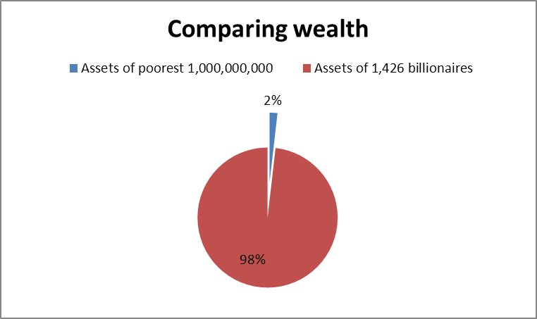
Let us assume that each of these very poor persons on average has assets worth $100, which would give a total of a billion people owning assets worth $100,000,000,000. And we learn from Forbes magazine that each of the billionaires on average has wealth of $3.8 billion, so this means that the total wealth of the billionaires is: 1426 x $3.8 bn, or $5,418,800,000,000.
From this we calculate that
1,000,000,000 very poor people own assets worth
$ 100,000,000,000
1,426 billionaires own assets worth
$ 5,418,800,000,000
Which means that the poorest billion people (1,000,000,000) own, between all of them, just 1.84% of what the richest 1,426 own.
Or again, based on these estimates, each billionaire has wealth that is thirty-eight million times greater than each of the poorest billion.
Comparing income
If one billion people earn less than one dollar a day, the average must by definition be less. Let us assume 90 cents per day per person as our estimate. This produces a total annual income for the poorest billion of $365 x 0.9 x 1,000,000,000 = $328,500,000,000. A little over 328 billion dollars. (We have ignored non-cash benefits here since both the very poor and very rich each may receive non-cash benefits, albeit of different kinds).
The billionaires, we may estimate, should be able to get an annual return of at least 6% per year which is available as income, even if not taken as such. So we can calculate their total income potential as 6% of $5,418,800,000,000 = $325,128,000,000. A little over 325 billion dollars. Of course, billionaires in reality arrange their financial affairs including income and consumable resources in myriad ways to maximise tax advantages.
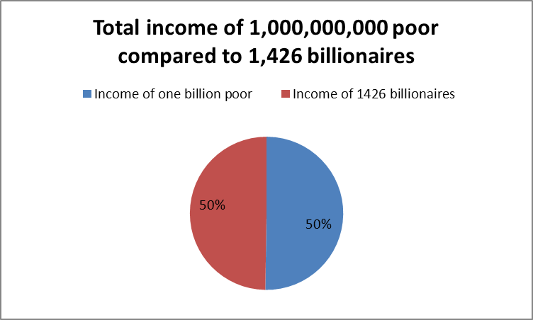
This means that the two camps receive an almost exactly equal income (within a 1% range), though there is the tiny difference that one camp has around 999,998,574 more ‘members’ than the other. And since the Dow Jones and FTSE 100 have kept rising in recent days, we may be confident that the total income of the billionaires has by now overtaken that of the poorest billion!
On average, each of the poorest billion has as annual income
$ 328.50
On average, each billionaire has as annual income
$ 228,000,000.00
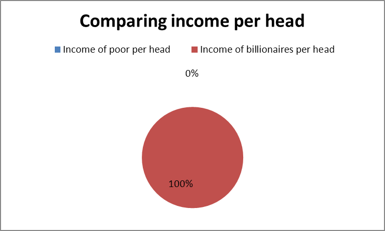
So from this we can estimate that each billionaire on our planet earns 694,064 times more than each of the poorest billion on earth.
Here are our pie charts which show – first – the % equality of total income of the billion very poor and the 1,426 billionaires…
total income of poor and billionaires
…and second, what this means when we compare income per head between the two groups, also in % terms. But what’s this? Alas, our chart cannot even begin to show a fraction of one per cent. The poor come out with just 0% of the income of the billionaires. But using our hi-tech pocket calculator, we find that the income per head of the poorest is 0.00013% of that of the average billionaire.


