Policy Research in Macroeconomics

Same old same old…Tory austerity

Severe as it has been for the welfare of the British people, eight years of so-called austerity under three Conservative governments are but the most recent manifestation of Tory assaults on public services.  Since Margaret Thatcher became prime minister almost forty years ago, contracting the public sector has been a constant theme across Tory governments.

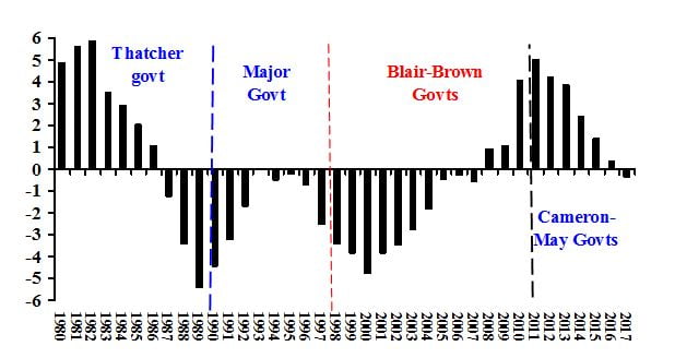
Chart 1 shows total pubic spending as share of GDP over four decades, 1980-2017.  In the first three years of the Thatcher government the share of public spending in GDP rose.  This unexpected rise resulted not from an expenditure increase, but from contraction of GDP, a severe recession consciously provoked by then-chancellor Geoffrey Howe with the putative purpose of reducing inflation.  The share of public spending declined continuously for the rest of the decade, falling from 42.8% in 1979, in the last year of the Labour government, to less than 35% in 1989 (Thatcher’s last full year in power).

By comparison the years of the Major government were relatively benign for public spending, though continuously below the 38 year average and falling after 1992.  The return of a Labour government briefly coincided with further decline, to 35% in 2000 from 37% when the Major government staggered to its unlamented end in a near electoral wide-out.  The decline at the end of the 1990s represented the reverse causality of the early 1980s.  A four year average growth rate of 3.5% resulted in GDP expanding faster than public expenditure.  During the last of the Blair years, 2000-2007, the public expenditure share in GDP rose almost continuously, to well above the period average.  In 2007 just before the global financial crash public spending relatively to GDP had returned to the four decade average of 39.7%.

In the early 1980s a policy-induced recession pushed up the spending-GDP ratio by driving down GDP.  A far more severe and certainly not intended recession arrived in 2008. The collapse in GDP combined with strong countercyclical fiscal policy took public sending to 44% of GDP in 2010.  Following the reactionary tradition of Thatcher, the Cameron governments quickly and aggressively reversed that increase. This neo-Thatcherite assault on public spending, faithfully continued by the May government, again brought the spending share below 40%.

Chart 1: Tory austerity, been there before
Total public spending as share of GDP, 
percentage point deviations from average (39.7%),1980-2017
 

Source:  UK Treasury .

Source: UK Treasury.

The second chart shows the clear link between squeezing public expenditure and economic growth, an interaction I analyzed in an earlier article for Prime. During the Thatcher-Major years when the public expenditure share fell drastically, and remained consistently for long term trend, the 17 year average GDP growth rate was 2.2%, negative in five of those years. 

By contrast during the 10 Blair-Brown years prior to the global crisis, when the spending ratio rose, GDP growth increased to an average of 3%.  The seven full years of Cameron-May brought us back to the Thatcher-Major rates, even lower at 2.2%.  Four decades changed neither Tory economic policy nor its outcomes – a contracting public sector and growth rates well below potential.

Chart 2: Tory growth stagnation is nothing new
GDP growth, percentage point deviation from average (2.2%), 1980-2017

Note: Average growth rates for sub-periods on chart.  Source:  Office of National Statistics .

Note: Average growth rates for sub-periods on chart.  Source: Office of National Statistics.

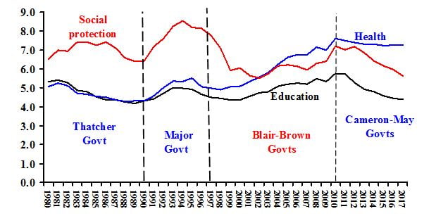
The pattern true for public spending as a whole was repeated in its parts, as the third chart demonstrates.  Expenditure on health and education declined as share of GDP throughout the Thatcher years, had a slight recovery during the austerity-light Major years.  It then rose substantially under Labour governments.  Especially striking is the rise in spending on health care from 5% in 1997 to 8% in 2008.

Of special analytical importance is the pattern for social protection, which includes unemployment support as well as so-called welfare payments.  These rose in the early Thatcher years and rose again under the Major government.  A look back at Chart 2 shows that these increases approximately coincide with the two Tory recessions, 1980-82 and 1990-92.  These increases in spending on social protection consisted of higher unemployment support, increases means-tested benefits as incomes declined, and early retirement (a form of the “discouraged worker” phenomenon).

The striking statistics for the Cameron-May years are for education and social protection.  In 2017 the share of spending on education reached its lowest level in thirty years (since 1986-87).  As one would expect, social protection most obviously manifests the austerity ideology, in continuous decline from 2012 despite the near-stagnation of economic growth.  By contrast, the long decline in the social expenditure share under Labour, 1998-2003, occurred when the GDP growth rate was far above that of the Osborne years (over three percent compared to barely two).

Chart 3: Social Protection, Health & Education Expenditure, 1980-2017
(share of GDP)

Source:  UK government .

Source: UK government.

The Thatcher government’s attack on the public sector sought its justification in purely the ideological language of individualism versus collectivism as embodied in the infamous 1987 denial, “There is no such thing as society, there are individual men and women, and there are families”.  The Cameron government, especially through its chancellor George Osborne, used a less superficially ideological approach, that “there is no alternative”.  Along with this false assertion, the Cameron government sought to conceal the impact this new version of austerity by where it made the large expenditure reductions.

In pursuit of allegedly non-ideological austerity, the Cameron governments and the May successor sought to conceal cuts to the extent possible.  Chart 4 shows this tactic.  The chart traces four types of expenditure, in constant prices with each category set to 100 at the end of the Labour government (2010 Q2 =100).  At least two messages come clearly from the chart.  First, public investment played a major role in the attempt by the Brown government to counteract the effect of the global recession. 

Second, while total expenditure, central plus local government, fell after 2010, central government current expenditure hardly changed.  The burden of the spending cuts fell on public investment and local government.  Due to Treasury accounting practice, current expenditure hardly changed.  Thus, after ten years of rising real expenditure, 1998-2007 before the global recession, total expenditure fell (black line).

Chart 4:  Public Expenditure in constant prices by category, 
1998Q1-2018Q1 (2010Q2 = 100)

Source: ONS,  Public Sector Finances .

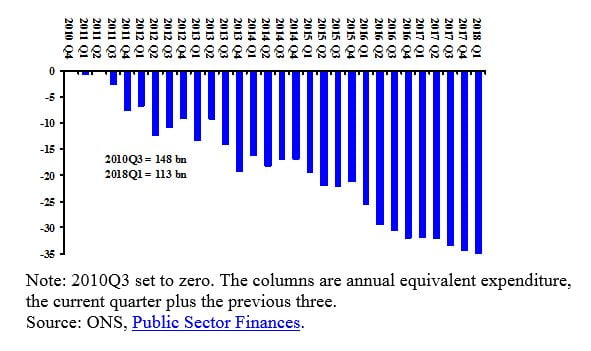
Chart 5 shows what almost every local government official knows quite well – devastation of local services.  The chart sets the third quarter of 2010 as zero, then measures annual equivalent changes in central government transfers to local government, again in constant prices.  Transfers through the first year of Conservative {“Coalition”) government were down by almost three billion in 2018 prices, and by 35 billion through the first quarter of 2018.  To place these cuts in context, in fiscal year 2017/18 central government transfer were almost 90% of local government expenditure.
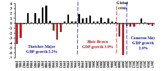
Chart 5: Central Government Transfers to Local Governments, 
2010Q3-2018Q1: Changes under Conservative Governments, £ billions
(annual, constant prices of 2018)

Note: 2010Q3 set to zero. The columns are annual equivalent expenditure, the current quarter plus the previous three.   Source: ONS,  Public Sector Finances .

Note: 2010Q3 set to zero. The columns are annual equivalent expenditure, the current quarter plus the previous three.   Source: ONS, Public Sector Finances.

Recent opinion surveys indicate that while a majority of the British adult population opposes austerity policies, a majority also considers the Conservative Party more reliable on economic policy.  If that perception refers to the tendency of governments to have fiscal deficits, it has no factual basis.

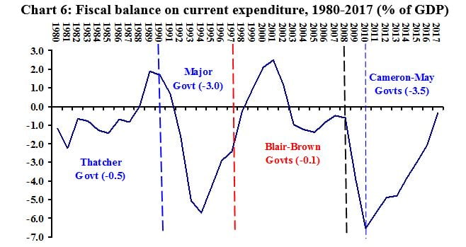
Chart 6 provides information on the fiscal balance on current expenditure – central government spending excluding investment.  During the ten years of Thatcher government that deficit averaged minus 0.5% of GDP, falling to minus three percent during seven years of John Major.  Labour up to the global recession achieved a near zero current balance, in while the Cameron-May period the average rose to minus 3.5.  Jeremy Smith has analysed in more detail this tendency for Conservative governments to generate larger deficits than Labour governments. 

If we refer back to Charts 1 and 2, the explanation is obvious.  Austerity policies have depressed growth under Conservative governments, slower growth undermines revenue growth and makes deficits more difficult to reduce.

Source:  UK government .

Source: UK government.

For the last 40 years Conservative governments have consistently pursued a policy of reducing the public sector.  Labour governments, even under the neoliberal Tony Blair, have maintained or increased the public sector.  In pursuit of their ideological mission, Tory governments have overseen consistently larger fiscal deficits than Labour governments.

2 responses

  1. Prof Paul Krugman and Prof Simon Wren Lewis aren’t wrong about austerity policies, a shame their names and works aren’t widely known by the general public. Austerity is a delusion. Timber imports contribute to the second largest trade deficit by sector in the UK after food. We are also the second largest importer of timber in the World after China. The level of forestry investment in the UK is pitiful, and that story extends to other industries. I work in a govt section that deals with forestry, and funding and salaries have been slashed to the point of making it defunct. It struggles to retain and recruit and it is getting worse. The flamboyant claims and expectations of govt to meet woodland creation targets is unrealistic. Austerity is real, and lack of investment is real. Meanwhile the TAR govt in Tibet last year (under Chinese control) created 75,000 of new woodland. What did the UK create? Not much more than 10,000ha. Lack of investment in skills, knowledge, people etc is a real issue in the UK.

Leave a Reply

Your email address will not be published. Required fields are marked *

This website collects cookies and analytic data. To use our website you must consent.
For more information read our Privacy Policy.